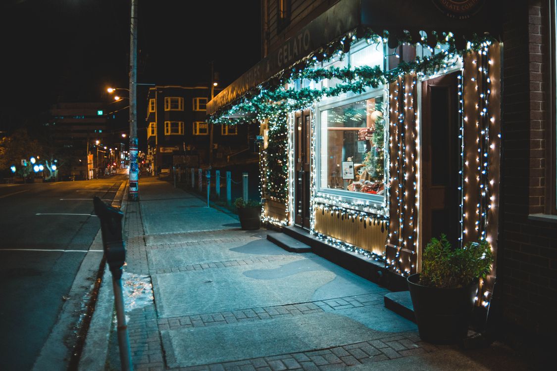
The best signage fonts do their work before a customer decides to stop. In fact, a storefront sign has only a few seconds to turn a passerby into a visitor, and it must do that work from across a busy street.
This guide uses a simple three-distance test. First, you stand ten metres away and ask what you can read. Second, you move to five metres and check the window. Third, you step to one metre and read the door details. Therefore, each section below follows that order.
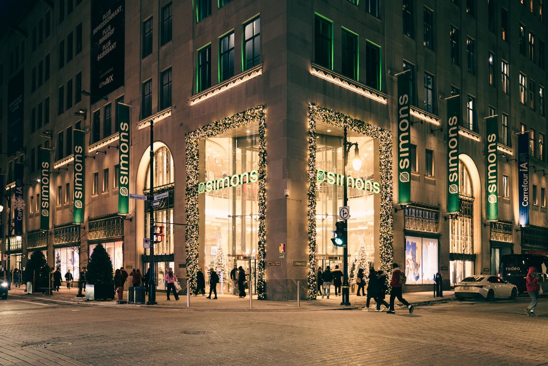
The Three-Distance Test
Start on the street, not at the desk. For example, print your sign at a small size, pin it to a wall, and walk away from it. Then ask a friend to do the same test without any hints from you.
In addition, ask three short questions at each distance. What can you read first? What can you read second? Would you know what the shop sells? However, do not answer from memory. Write the answers down instead.
Signage Fonts at Ten Metres: The Street Test
At ten metres, signage fonts have only one job: the shop name must survive. As a result, this is the place for a bold, open letterform with generous spacing. A sturdy sans-serif or a strong serif usually works well here.
For example, a short name in a heavy weight can be read across the road. In contrast, a thin script at this distance often melts into a single wavy line. Similarly, a crowded line of words forces the eye to work too hard, and most passersby will simply keep walking.
The Squint Test
Squint at the sign from ten metres away. If the main word still holds its shape, it passes. If it breaks into blobs, enlarge the type or simplify the wording. Ultimately, a street sign that fails this test has failed its main job.
Signage Fonts at Five Metres: The Window Test
At five metres, the window takes over. Here, signage fonts can carry a second message, such as a short greeting, a service, or a seasonal note. However, the window must not compete with the fascia above it.
For example, one clear line on the glass can welcome a shopper without shouting. In addition, keep the line short and leave plenty of clear glass around it. In contrast, a window covered edge to edge with offers looks busy, and busy glass hides the goods inside.
Signage Fonts at One Metre: The Door Test
At one metre, the reader is already interested. Therefore, this is the place for the small print: opening hours, a short welcome, or a simple direction. Here, signage fonts can be smaller and calmer than they are on the street.
For example, a clean serif or a rounded sans-serif keeps small words easy to read at close range. In addition, strong contrast matters more than decoration at this size. In contrast, a highly decorative face may charm at a glance, but it can tire the eye when the reader must follow real information.
Finally, read the door text in daylight and under shop light, and enlarge the type if you need to squint.
Window Versus Fascia: Two Different Jobs
The fascia and the window are not two versions of the same sign. The fascia names the shop from far away, while the window invites the shopper closer. Therefore, they should not repeat the same long message.
For example, let the fascia carry the name alone, in the largest type on the storefront. Then let the window carry one supporting idea, such as a seasonal welcome. In addition, use the same family or a calm partner face, so the two signs feel like one shop rather than two neighbours.
In contrast, two loud display faces on one storefront usually fight for attention. Similarly, two scripts can blur into one another. As a result, contrast is more useful than novelty: pair weight against lightness, and size against smallness.
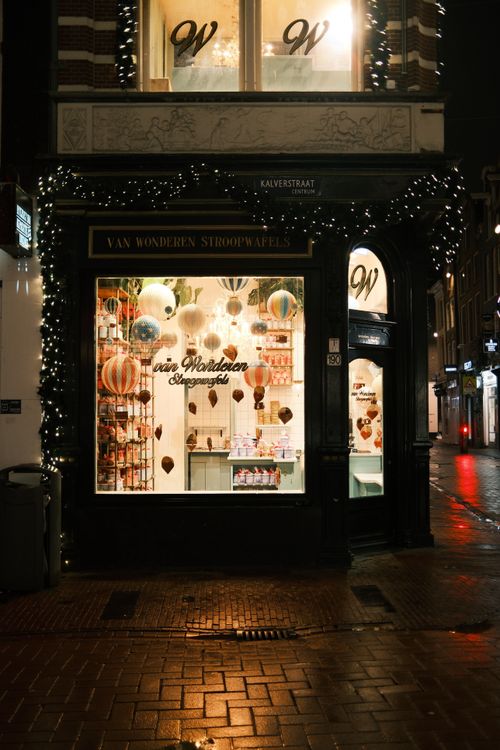
Signage Fonts After Dark: Light, Contrast, and Glow
Holiday streets stay busy after dark, so signage fonts must work at night as well as by day. In fact, light can change a sign completely, for better or worse.
For example, a light letter on a dark fascia can glow clearly after sunset. However, a thin stroke can disappear inside a halo of light, so bolder weights are usually safer for lit signs. In addition, test the sign at night before you approve it. A face that looks crisp in daylight may look washed out under a spotlight.
Meanwhile, watch the reflections on the glass. A window message that fights its own reflection will lose readers quickly. As a result, place the main words where the glass stays darkest.
Hierarchy From the Street
A good storefront has a clear order of reading. First comes the shop name. Second comes the one thing the shop wants you to know. Third comes everything else, and only if the reader steps closer.
Therefore, give each level its own size and weight. For example, the name can be large and bold, the second line clearly smaller, and the door details smaller still. In addition, leave space between the levels, because crowded type reads as hurried rather than welcoming.
In contrast, a storefront where every line shouts at the same size has no hierarchy at all. Ultimately, the shopper should know in seconds what the shop is and why it is worth entering.
Materials, Contrast, and Weather
Material changes how type looks outdoors. For example, the same letterform can feel crisp on smooth painted board and soft on rough timber, while rain, frost, and strong sun all punish weak contrast.
On dark timber or brick, choose a light letter with a sturdy shape. On pale render or glass, choose a darker letter with the same strength. However, avoid very thin weights outdoors, because they can break up in weather and look fragile from the street.
Similarly, check the sign in rain if you can, because wet surfaces darken and subtle shades may vanish. As a result, strong contrast is not a style choice for a storefront. It is the difference between being seen and being missed.
Signage Fonts: A Final Street Checklist
Run this checklist on the real street, not only on screen. First, read the shop name from ten metres away. Second, read the window line from five metres. Third, read the door details from one metre.
In addition, return after dark and repeat all three distances. Does the type survive shop light and street light without losing its shapes? Meanwhile, check the pairing. Does the fascia name the shop, and does the window invite rather than repeat? However, if any answer is no, fix that one problem before you change anything else.
Finally, ask someone who has never seen the shop to walk past it and tell you what they read first, what they read second, and whether they would step inside. In short, the best signage fonts do not ask to be admired for their shapes. They turn a busy street into a clear invitation, and that is the impression the shopper keeps.
Once the shopper is inside, the same care belongs on what they carry home. For gift packaging in a different setting, see our earlier guide to holiday gift packaging: https://creacystudio.com/packaging-fonts-holiday-gift-boxes-tags-wrapping/
Photos: Pexels