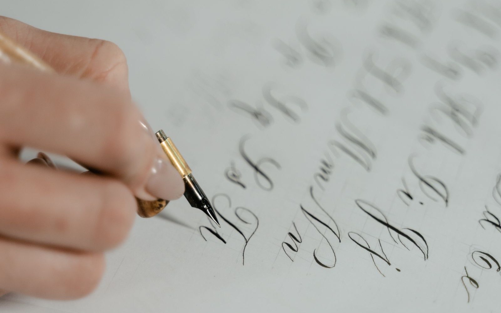
A holiday sale banner gets about as long as a thumb takes to scroll past it. Therefore, the banner fonts you choose matter more than the photo, the palette, or the sparkle overlay you added at midnight. In fact, most small-brand banners fail for one plain reason: the type asks the shopper to work.
Instead of handing you another list of typefaces, this article takes one banner apart. We will look at its three working parts, the headline, the price, and the CTA, and fix each one in turn. As a result, you can run the same teardown on your own graphics before the season starts.

Meet the banner: one holiday sale, three jobs
Olivia Wilson runs a small candle brand. For her holiday sale, she built a wide website banner. It had a flat-lay photo of pine and ribbon, and the words “Our Cozy Season Holiday Sale Is Finally Here” in a thin looping script. It also had a price in the same script and a small outlined button that said “Click here”.
The banner looked festive. However, on a phone it read as a pretty photo with some gold scribbles on it.
Each of the three text elements has a different job. First, the headline sets the mood and names the event. Second, the price gives the reason to care. Finally, the CTA tells the shopper what to do next. Because Olivia set all three in one decorative face, none of them could do its job. In short, her banner fonts were chosen for looks alone.
Teardown part 1: the headline
Olivia’s headline had nine words, set in a hairline script over a busy photo. Consequently, the thin strokes disappeared wherever they crossed a pine branch.
The fix started with the words, not the font. For example, “Our Cozy Season Holiday Sale Is Finally Here” became “The Holiday Sale”. Three words can be set far larger than nine. In fact, size is the cheapest legibility upgrade there is.
Banner fonts for headlines: what to look for
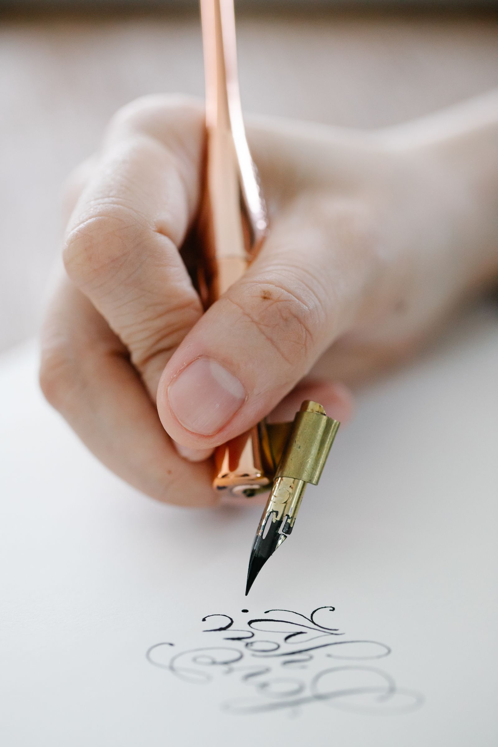
Once the copy is short, the headline can carry personality. In other words, this is the one place where an expressive display face earns its keep. Still, it has to pass a few checks:
- Sturdy strokes. High-contrast serifs and monoline scripts have hairlines that vanish at small sizes. Therefore, pick letters that hold their weight when the banner shrinks.
- Open shapes. Look at the a, e, and s. If the openings close up when you squint, the word will blur into a blob.
- Restraint with script. If you love a script, use it for one or two words, such as “Holiday”. Then set the rest in a sturdy sans.
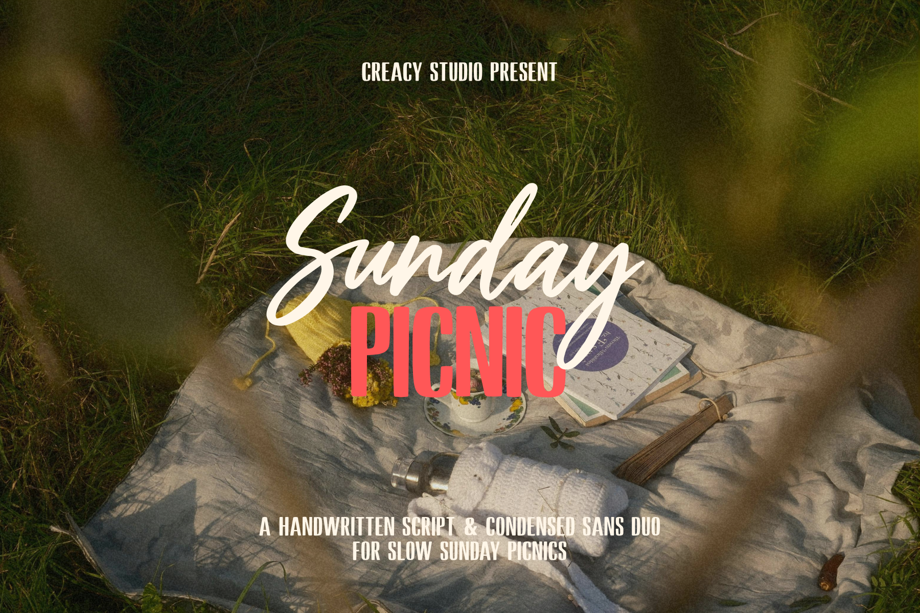
Olivia kept the festive feel, and she did it with one family. She rebuilt the headline in Sunday Picnic, our handwritten script and sans duo. “Holiday” went into the script at the largest size. Meanwhile, “The” and “Sale” went into the companion sans in capitals. In addition, she put a soft dark panel behind the text so the photo stopped competing with it.
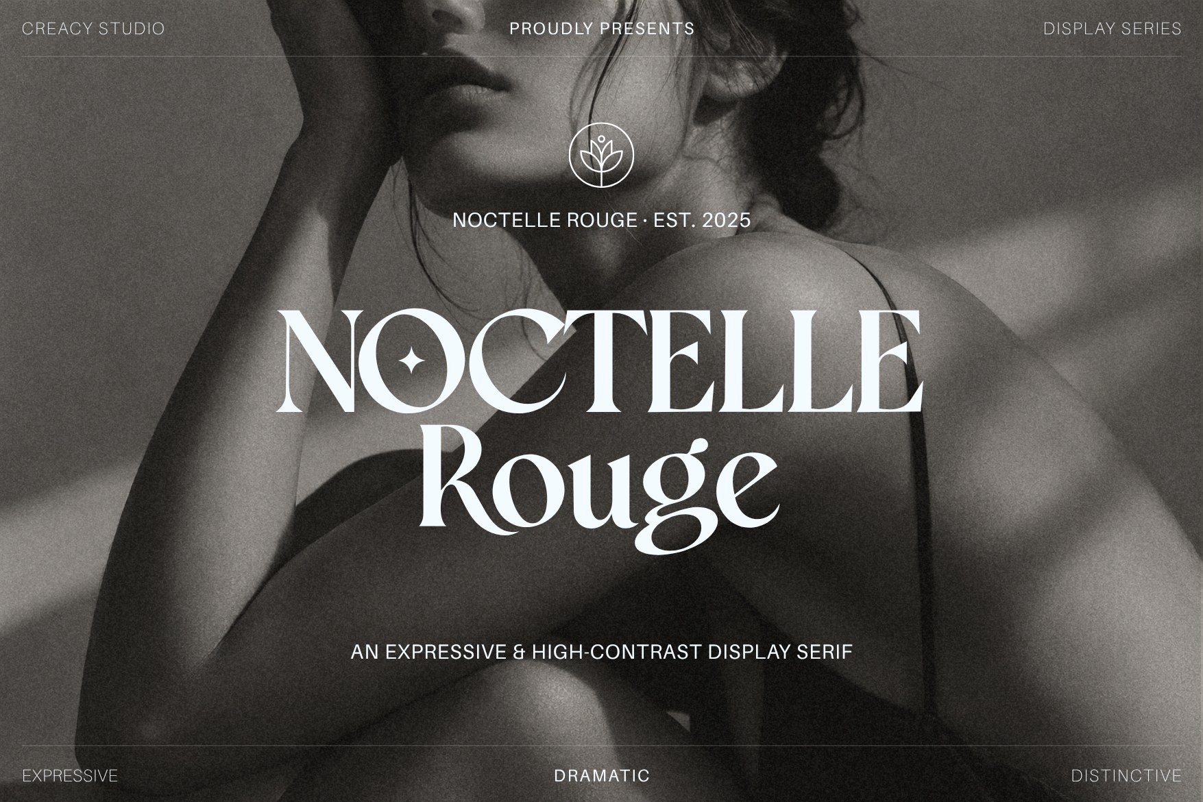
Your brand may lean another way, of course. For example, an elegant label could give the headline to a display serif such as Noctelle Rouge. However, it is a high-contrast face, so keep it large and keep it out of the price and the button.
Teardown part 2: the price
In the original banner, “from $14” sat under the headline in the same looping script. As a result, the 1 looked like a lowercase l, and the 4 had a flourish that read like a 9. A shopper who has to decode a price usually doesn’t.
Banner fonts and numerals: the detail most brands miss
Many decorative banner fonts are drawn letters-first, and the numbers arrive as an afterthought. Therefore, before you commit to a typeface, type out your actual prices and check four things:
- Lining figures. Old-style numerals dip below the baseline, which is charming in a paragraph. On a banner, however, they make a price look uneven. Lining figures sit at one height and read faster.
- Distinct digits. Compare 1 and 7, 3 and 8, 5 and 6. Similarly, compare the zero with a capital O.
- A matching currency symbol. Some fonts ship a dollar sign that is noticeably lighter than the digits. Consequently, the price looks patched together.
- Weight. The price should be the second-loudest thing on the banner, so a bold or extra-bold weight helps.
Olivia typed “$14” in the sans from the same duo and checked it against this list. Then she gave the number its own line and set “Gift sets from” small above it. As a result, the price reads before the shopper has to think.
Teardown part 3: the CTA
Olivia’s button said “Click here” in the script again, inside a thin gold outline. On the photo, it was nearly invisible. Moreover, the words said nothing about what happens after the click.
Banner fonts for buttons: plain wins
The CTA is the smallest text on the banner, so it needs the plainest type. Specifically:
- Reuse the sans from the price. One duo, or two families at most, is enough for a banner.
- Choose a medium or bold weight. Light weights thin out at button size.
- Try sentence case first. All caps can work for two short words. However, add a little letter-spacing so the letters don’t clump together.
- Fill the button. A solid shape with high-contrast text beats an outline. If you are unsure whether your colors are far enough apart, run them through the WebAIM Contrast Checker. It takes a minute, and it removes the guesswork.
- Say the action. For example, “Shop the sale” or “See gift sets” tells the shopper where they are going.
Olivia’s button, therefore, became a solid cream pill with dark green text: “Shop gift sets”.
The rebuilt banner, side by side
After the teardown, the banner had the same photo, the same colors, and the same offer. However, it now had a clear order:
- The Holiday Sale, in the script and sans duo, with the script on one word only.
- Gift sets from $14, in the same sans, at roughly half the headline size.
- Shop gift sets, in the same sans, on a solid button.
Avery Davis, who runs a small craft brewery, ran the same exercise on a square social graphic and ended up somewhere different. One word, “Winter”, went into our blackletter Eisenkraft, and everything else went into a plain sans. Likewise, your own answer will depend on your brand. Ultimately, the method matters more than the specific banner fonts.
If your holiday boxes and labels need the same treatment, our packaging fonts tutorials show how to carry these choices onto printed pieces as well.
A three-second test for your banner fonts
Before you export, test the banner the way a stranger will meet it:

- Shrink it. View the design at phone width, or zoom out until it is about as wide as your palm. Then check whether the headline still reads.
- Glance, then look away. Open the file, count to three, and close it. Afterwards, write down what the sale is, what it costs, and what to do next. If one of the three is missing, that element needs more size, weight, or contrast.
- Ask someone outside the business. Because you already know the offer, you will read words that aren’t really legible. A friend won’t.
Before you export
In short, good banner fonts are less about finding one perfect typeface and more about giving each element the type its job needs. First, give the headline personality and sturdy strokes. Second, give the price clear, bold numerals. Third, give the CTA the plainest letters you have. Above all, keep the family count to two and let size do the sorting.
Finally, check your font license before the banner goes live, because a sale graphic is commercial use. Our plain-English guide to commercial font licenses explains what that covers. Then save the layout as your own template, so the next sale only needs new words.
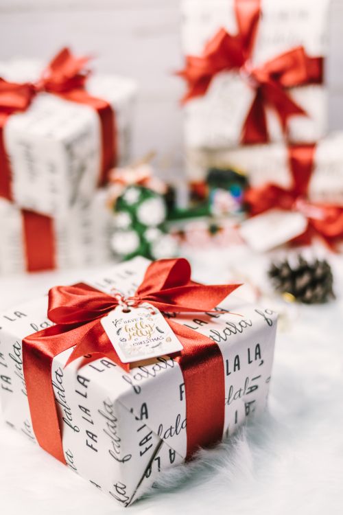
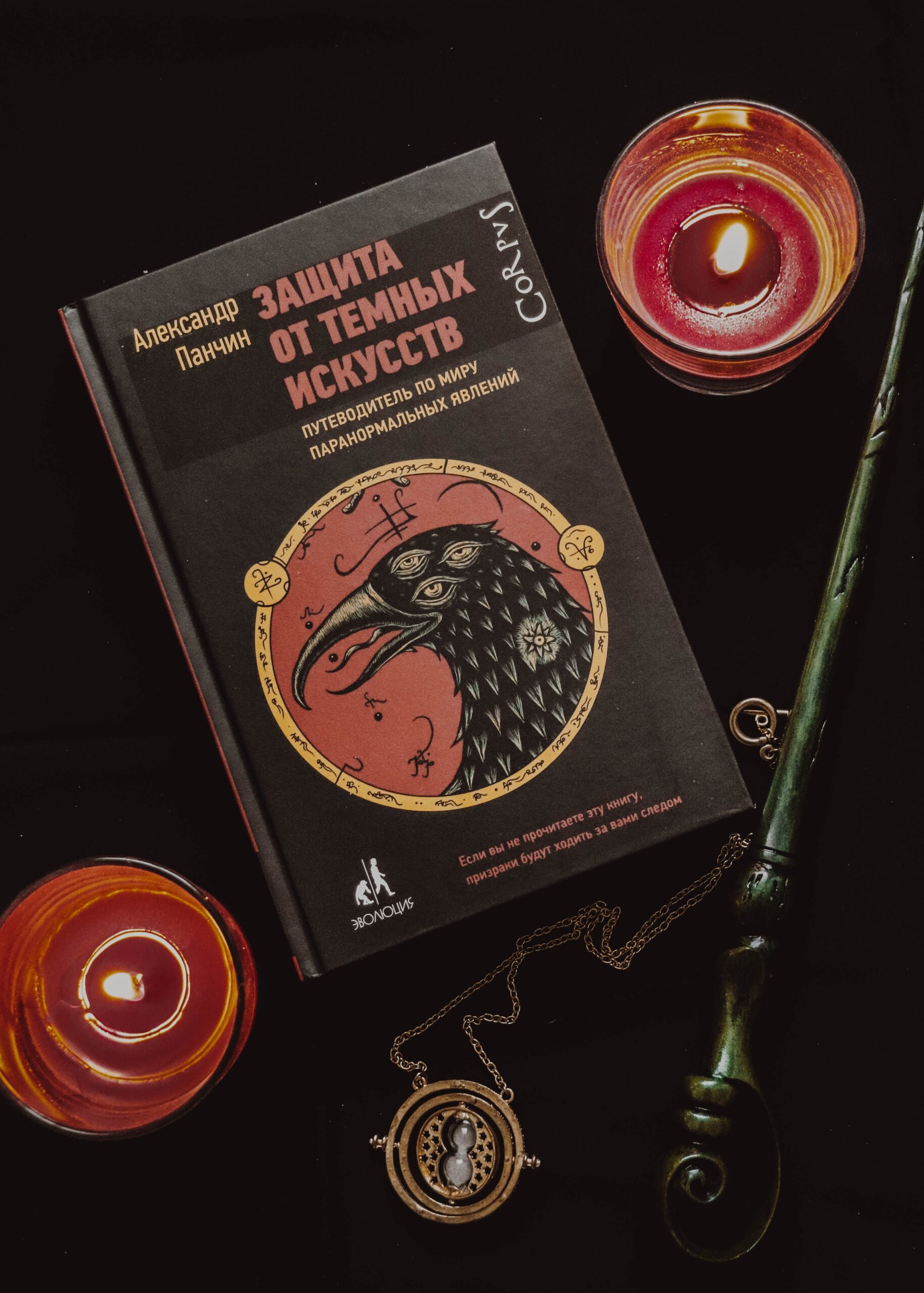
Photo credits: Nati, Katya Wolf, Tamanna Rumee, Miguel Á. Padriñán, and Thirdman, via Pexels.