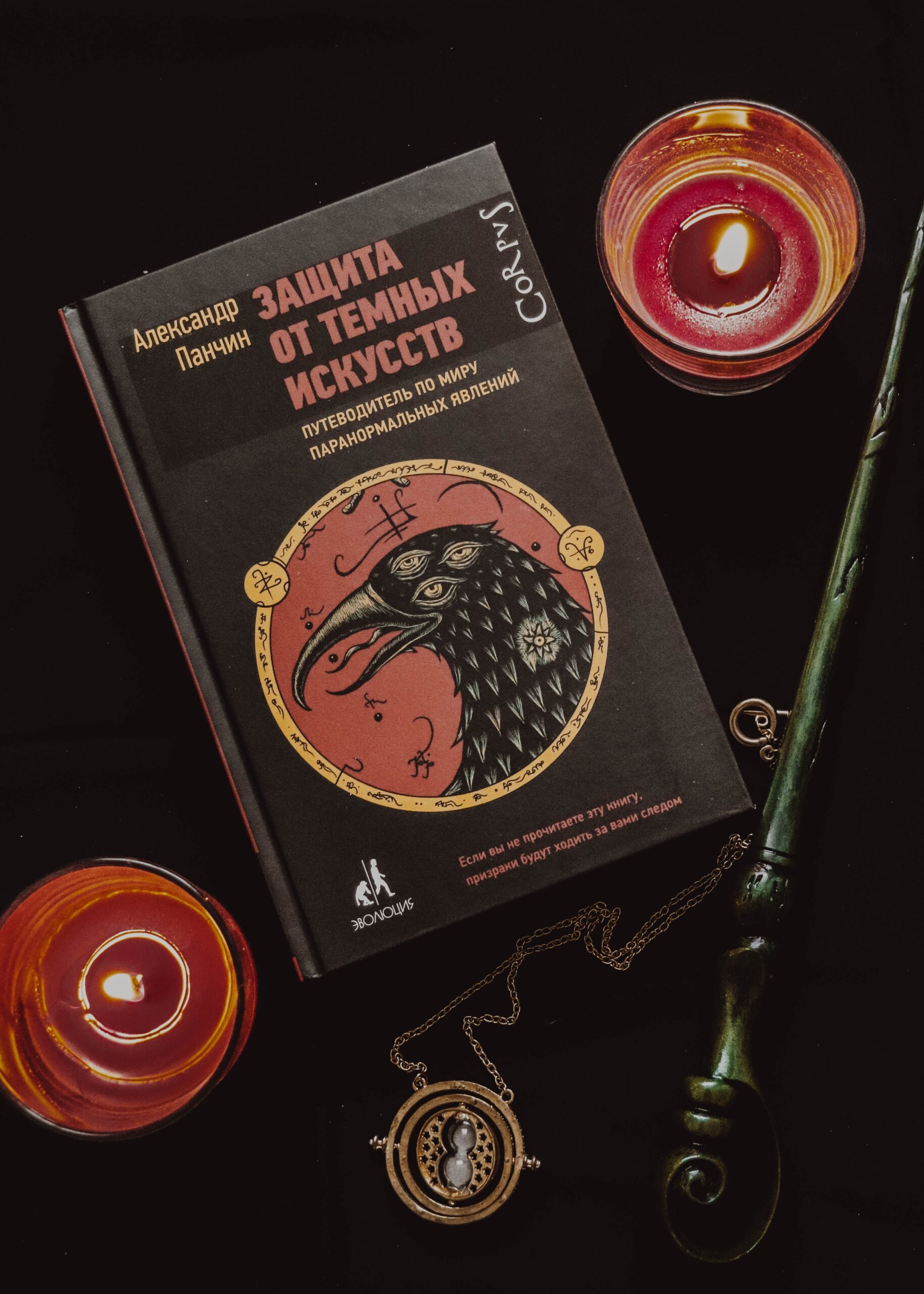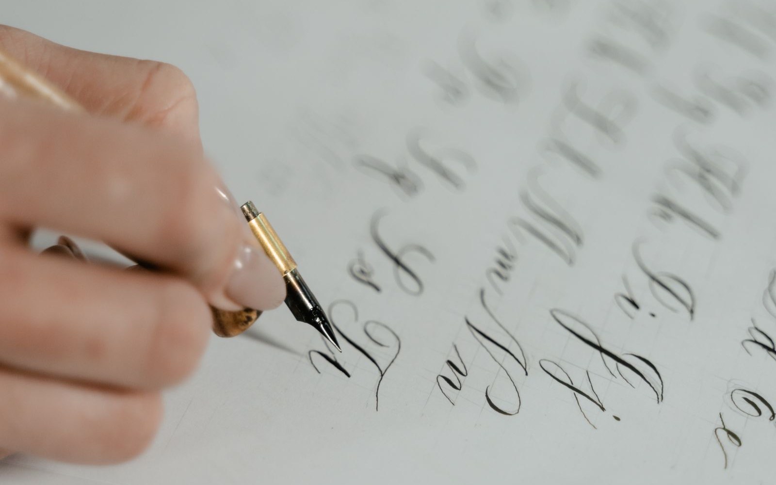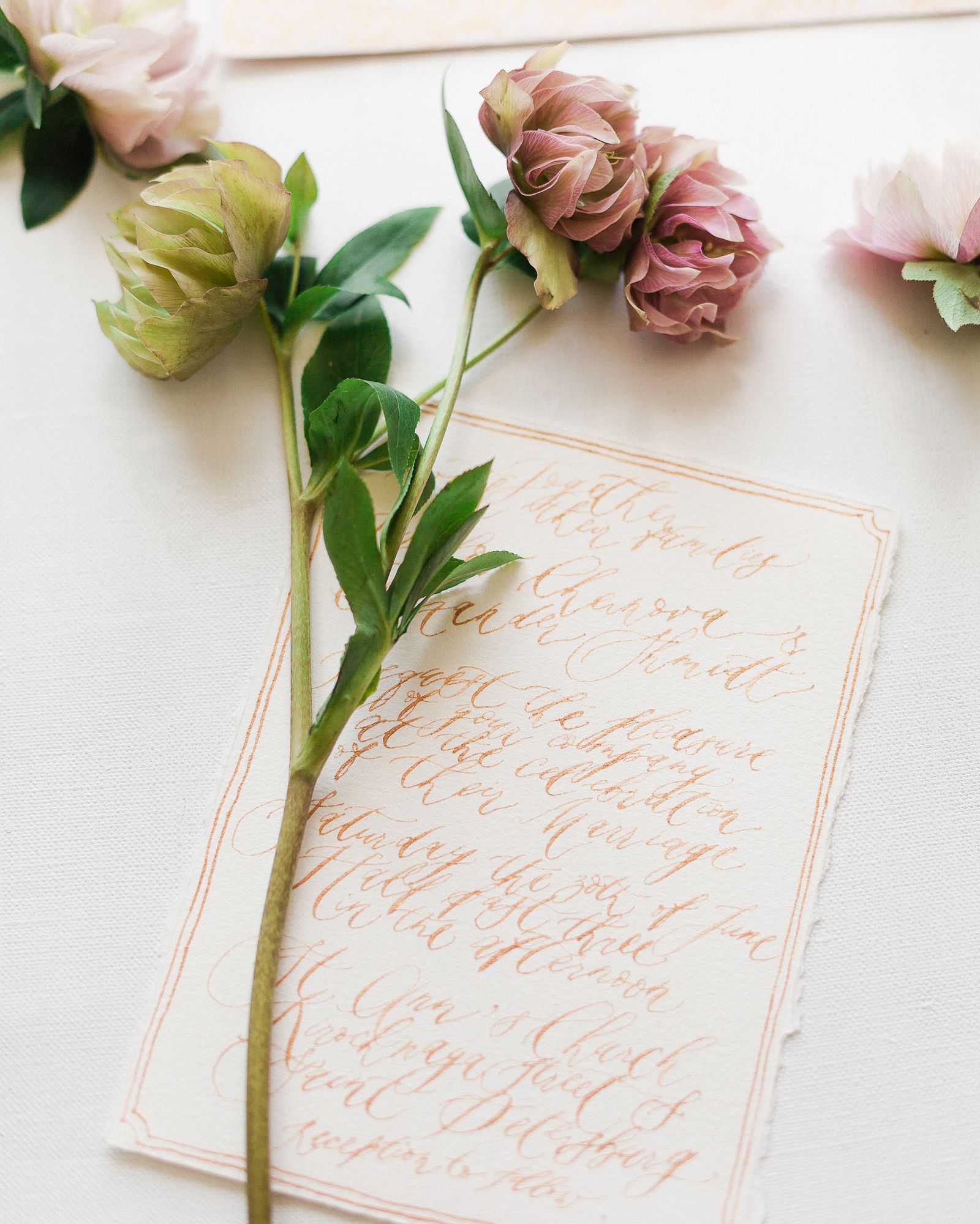
The best packaging fonts do their work before a gift is opened. In fact, a box, a tag, and a sheet of wrapping paper tell the receiver how much care went into the gift, and they do it in the first few seconds.
This guide uses a simple unboxing test. First, you look at the closed box from arm’s length. Second, you read the tag in your hand. Third, you notice the wrapping as it comes off. Finally, you judge whether the whole package felt like one thoughtful object or a pile of separate parts. Therefore, each section below follows that order, and each test can be run with a printed proof before you commit to a full run.
The Unboxing Test, Explained
Start with the real object, not the screen. For example, wrap one box, write one tag, and place both on a table under normal room light. Then step back and look at them as a receiver would.
In addition, ask three short questions. Can you read the main words at once? Do the box, the tag, and the wrapping look like they belong together? Would you feel pleased to hand this package to someone? However, do not answer from memory. Instead, write the answers down, because small type problems are easy to miss when you already know what the package says.
Packaging Fonts at First Sight: The Box
The box carries the biggest type on the package. As a result, it sets the tone for everything that follows. A bold display face can feel festive and confident, while a quiet serif can feel refined and steady. Similarly, a warm script can feel personal, although it needs more room and stronger contrast than a sturdy sans-serif.
Good packaging fonts on a box do one job first: they make the main message readable at a glance. For example, the recipient’s name, a short greeting, or a brand mark should survive a quick look from across a room. In contrast, a beautiful letterform that disappears at that distance has failed its first test, no matter how elegant it looks up close.
The Hierarchy Check
Give the box only one hero message. Then let the second line support it at a clearly smaller size. In addition, leave generous space around the hero words, because crowded type reads as hurried rather than premium.
Packaging Fonts on the Tag: Small Type, Big Job
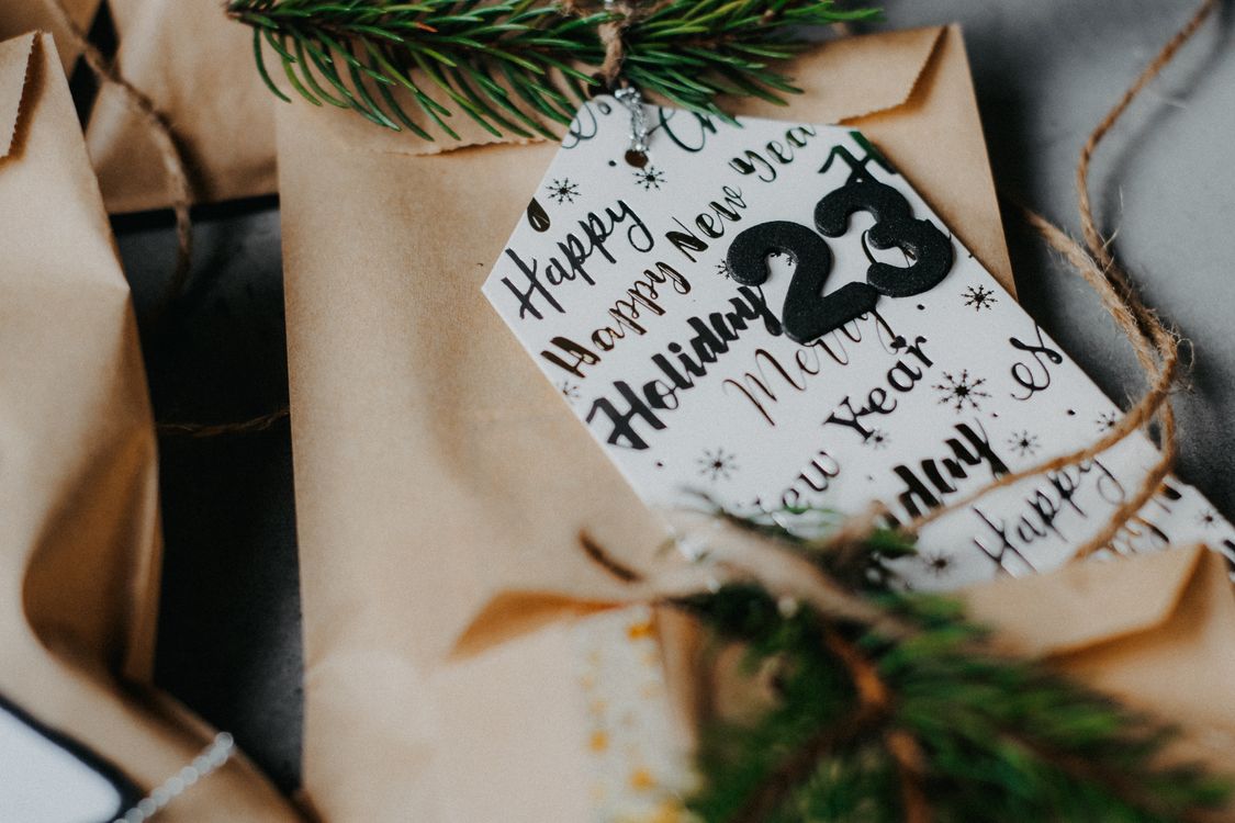
The tag is where most gift packaging goes wrong. It is small, it is handled closely, and it often carries the most personal words. Therefore, it deserves the clearest type on the whole package, not the most decorative.
On a tag, packaging fonts must stay legible at a small size. For example, a script with tight loops may look charming on a large poster, but it can collapse into a tangle when it is printed two centimetres tall. In contrast, a clean serif or a rounded sans-serif keeps its shapes open, and that openness is what makes small words easy to read.
In addition, keep the tag to a few words. A short greeting, a name, and perhaps one small line underneath are enough. Meanwhile, resist the urge to fill every corner. White space on a tag is not empty space; it is the frame that lets the words breathe.
Finally, print the tag at its real size and read it in normal light. If you need to squint, enlarge the type or simplify the wording. Ultimately, a tag that is easy to read feels more thoughtful than a tag that merely looks ornate.
Wrapping Paper and the Quiet Second Read
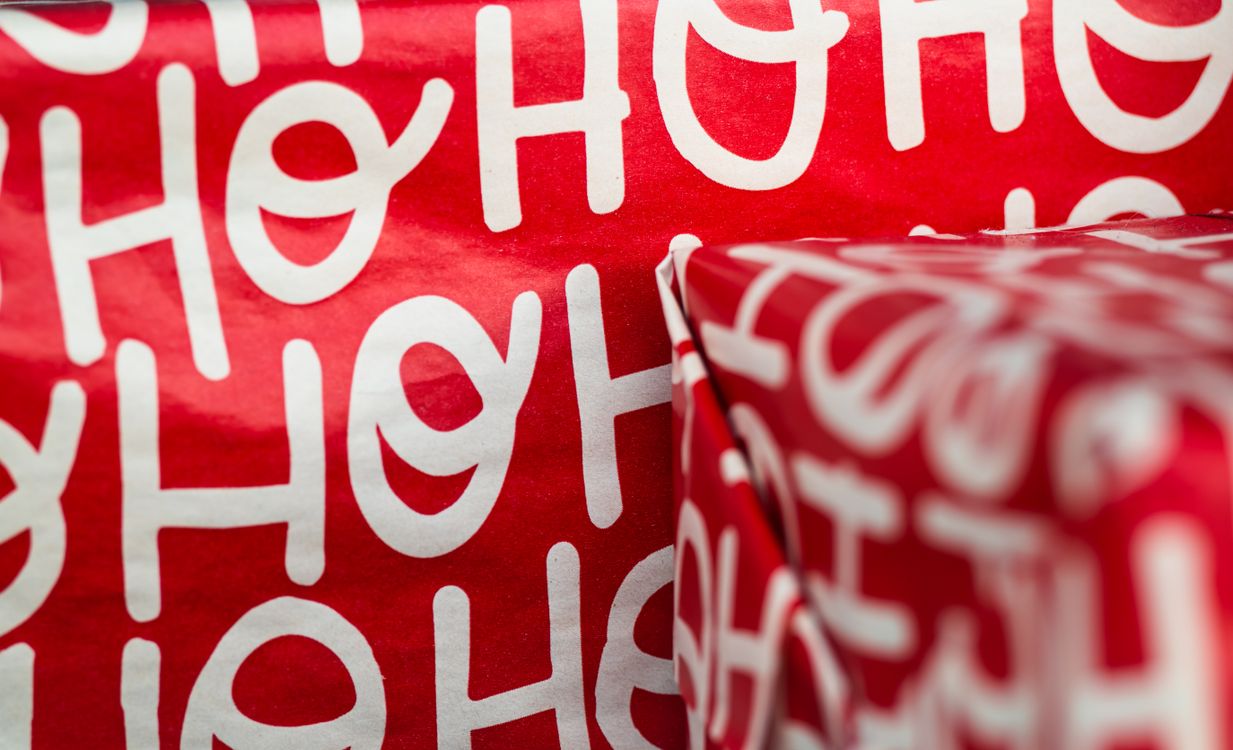
Wrapping paper is read twice. First, it is seen as a pattern from a distance. Second, it is noticed up close as the paper folds, tears, and moves in the hand. Therefore, type on wrapping should work as texture first and as a message second.
For example, a repeated word or a short phrase can create a rhythm across the sheet. However, the repeat should stay light. If the words are too large or too dark, they compete with the box and the tag. In contrast, a softer repeat lets the box remain the hero while the wrapping adds warmth around it.
Similarly, consider how the paper behaves at a fold. A long word that breaks awkwardly across a corner can look like a mistake. As a result, short words and generous spacing are safer choices for wrapping than long sentences. In short, wrapping type should reward a second look without demanding attention on the first.
Packaging Fonts and Material: Paper, Foil, and Ribbon
Material changes how type looks. For example, the same letterform can feel crisp on smooth coated paper and soft on uncoated kraft. In addition, foil and ribbon add shine, and shine can swallow thin strokes.
On textured paper, choose letterforms with sturdy shapes and open counters. However, avoid very thin weights, because they can break up in print and look fragile on a rough surface.
Three Pairings That Survive the Whole Unboxing
A pairing works when each face has a clear role. First, choose one voice for the hero message. Second, choose a quieter partner for the supporting words. Finally, keep the third face out unless it has a job that neither of the first two can do.
For example, a bold display face for the box can pair with a calm serif for the tag. In addition, the serif can carry the small personal message without competing for attention. Meanwhile, a simple sans-serif can handle practical details such as handling notes or a short care line.
In contrast, two loud display faces usually fight. Similarly, two scripts on one package often blur into one another. As a result, contrast is more useful than novelty: pair weight against lightness, size against smallness, and personality against calm. Ultimately, the receiver should remember the gift, not the struggle between its typefaces.
Packaging Fonts: A Final Print Checklist
Run this checklist on a real proof, not only on screen. First, read the hero message from across the room. Second, read the tag in your hand under normal light. Third, fold the wrapping and check that no important word breaks badly at a corner.
In addition, check the materials. Does the type survive kraft, foil, and ribbon without losing its shapes? Meanwhile, check the pairing. Does each face have one role, and does the quiet partner stay quiet? However, if any answer is no, fix that one problem before you change anything else. A single clear correction usually improves the whole package more than a fresh round of decoration.
Finally, test your packaging fonts with someone who has not seen the design before. Ask what they read first, what they read second, and how the package made them feel. As a result, you will learn quickly whether the unboxing feels premium or merely busy. In short, the best gift packaging does not ask to be admired for its type. It lets the gift itself feel considered, and that is the impression the receiver keeps.
For product packaging in a different setting, see our earlier guide to packaging for candles, beauty, and coffee: https://creacystudio.com/best-fonts-for-packaging-candle-beauty-coffee-labels/
Photos: Pexels (https://www.pexels.com/).