Choosing between script fonts and serif for premium gift branding is not a taste test. In fact, it is a positioning decision: the letterforms on the box tell the recipient what kind of gift this is before the ribbon comes off. Serif says heritage, order, and quiet confidence. Script says warmth, intimacy, and a personal hand. Both can feel premium, but they earn that feeling in opposite ways, and mixing them without a reason earns neither.
This guide gives you a decision matrix instead of a mood board. First, you will score both directions against five criteria that matter on real gift packaging. Then you will see the scenarios where each direction wins outright. Finally, you will get three tiebreaker questions for the cases where both look good. Therefore, by the end, you will have picked one direction on purpose, not by habit.
Script Fonts vs Serif: A Choice, Not a Taste
Premium gift branding has one job that ordinary packaging does not: it must make the recipient feel chosen. For instance, a serif face does this through structure. Its even strokes, clear serifs, and steady rhythm read as considered and trustworthy, like a letterpress card from a house with nothing to prove. In contrast, a script face does it through gesture. Its connected strokes and varied pressure read as written by a person, not set by a machine, and that human trace is exactly what makes a gift feel personal.
However, the two directions fail in different ways. Serif fails by feeling cold: too formal, too distant, too much like a bank statement in a beautiful box. Script fonts fail by feeling hard to read: too many flourishes, too little contrast, too much personality fighting the message. In short, the choice is not which style is prettier. It is which failure mode your brand can least afford.
The Decision Matrix: Five Criteria, Head to Head
Score both directions from one to five on each criterion, for your specific gift, before you look at any typeface. For example, a candle gift set and a leather goods box will score the same criterion differently, and that is the point: the matrix forces the gift to decide, not your personal taste.
| Criterion | Serif | Script fonts |
|---|---|---|
| Legibility at small sizes | Strong: open counters, steady rhythm | Weak: flourishes collapse at small sizes |
| Emotional signal | Heritage, calm, authority | Warmth, intimacy, celebration |
| Formality | High: suits ceremonies and corporate gifts | Low to medium: suits personal and festive gifts |
| Versatility across touchpoints | High: box, card, tag, and receipt all hold up | Narrow: shines on cards and wraps, struggles on labels |
| Pairing burden | Low: pairs with almost anything | High: needs a calm partner face for functional text |
Read the matrix twice. The first time, notice that serif wins on legibility and versatility, the two criteria that protect the recipient’s experience. The second time, notice that script wins on emotional signal, the criterion that makes a gift memorable. Therefore, the matrix rarely produces a tie: it reveals whether your gift needs to be understood first or felt first. In addition, it exposes the pairing burden honestly. Script fonts demand a second, calmer face for prices, care notes, and addresses, while serif can often carry the whole box alone.
When Script Fonts Win
Script fonts win when the gift is personal and the message is short. For example, a wedding favor box, a handwritten-style thank-you card, or a small-batch candle with the recipient’s name on the label all benefit from letterforms that look written rather than printed. In these cases, the recipient is one person, not a crowd, and the flourish reads as attention rather than noise.
Similarly, they win when the brand’s story is the maker’s hand: artisan soap, small-batch preserves, studio ceramics. Here, the connected strokes echo the handmade object inside, and the packaging stops looking like a container and starts looking like part of the gift. However, keep the script to the hero line. Names, short greetings, and single-line messages carry flourish well; paragraphs, prices, and instructions do not.
When Serif Wins
On the other hand, serif wins when the gift must speak to many people at once, or when the occasion is formal. Corporate holiday gifts, anniversary editions, and premium sets sold in stores all need letterforms that stay legible on a shelf, on a small tag, and in a photograph. In contrast, a script that charms one recipient can confuse a room full of them.
In addition, serif wins when the box carries information: scent names, ingredients, care instructions, or a brand story longer than one line. Its steady rhythm keeps long text readable, and its calm surface lets a single decorative element, such as a foil stamp or a ribbon, do the celebrating. As a result, serif is the safer default when you are unsure, because its failure mode is dullness, which is easier to fix with materials than illegibility is.
The Tiebreaker: Three Questions Before You Commit
When both directions score well, ask three questions in order. First, who reads this: one named recipient, or anyone who picks the box off a shelf? A named recipient favors script; a shelf favors serif. Second, how much text must the box carry? One line favors script; a paragraph favors serif. Third, what will the recipient photograph? If the answer is the name or greeting, script earns its place; if the answer is the whole box, serif holds the composition together.
Ultimately, if you answer honestly, the tie usually breaks on the first question. Meanwhile, if all three answers still point both ways, choose serif for the box and reserve script for the card inside. That split gives you the warmth of handwriting where it is read closely, without asking it to carry the whole package.
Script Fonts Without the Readability Cost
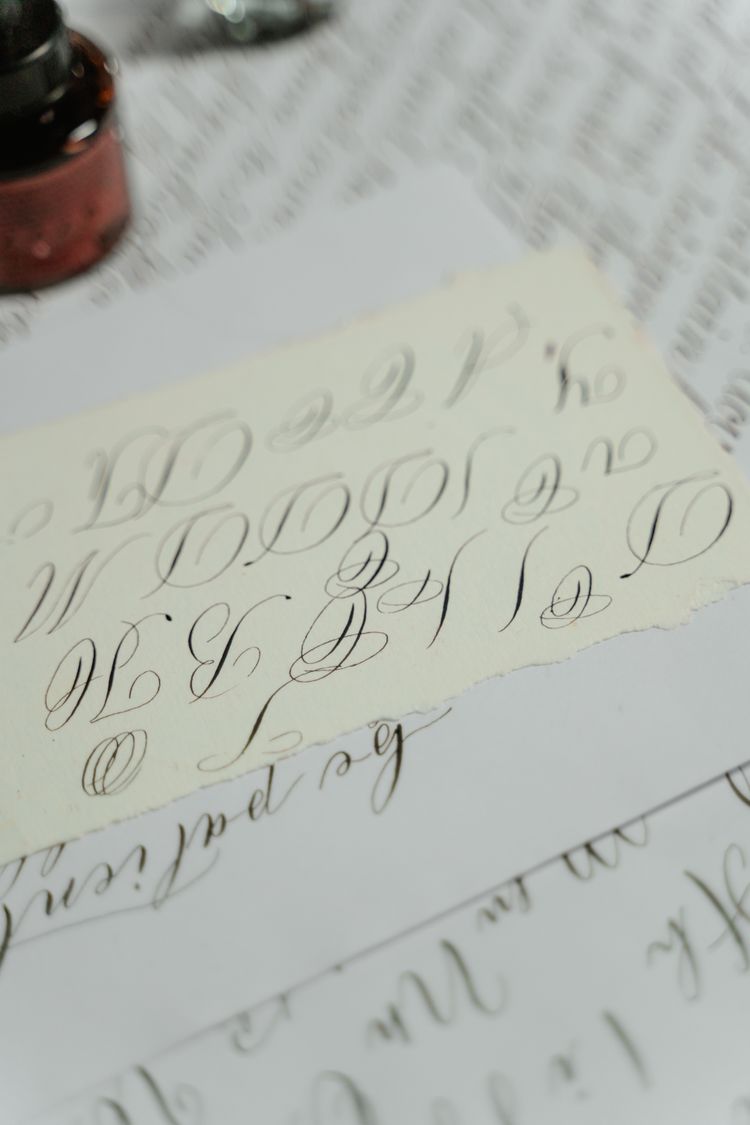
If script wins, protect readability with four guardrails. First, set script fonts large: a script set small loses its joins and turns into decoration. Second, limit script to one short line, and set everything else in a calm serif or sans-serif. Third, check contrast ruthlessly: thin script strokes disappear on textured paper and in dim light, so test a printed proof, not just a screen. Fourth, read it at arm’s length and ask a stranger to read it aloud; if they hesitate, simplify before you beautify.
These guardrails matter because script fonts are unforgiving at the edges. A flourish that looks elegant in a specimen can tangle with the next word on a curved label, and a loop that charms on a card can close up entirely on a small tag. In short, script rewards restraint: fewer words, larger sizes, and a quiet partner face for everything functional.
For example, pair a script greeting with a plain serif for the brand name and care text. The contrast makes both faces look intentional, and the recipient reads the message before admiring the lettering, which is the correct order. Ultimately, the script should feel like a signature, not a speech.
The Verdict: Pick One Direction
In short, serif or script? If your gift is formal, shared, or information-heavy, pick serif and spend the saved effort on materials: paper, foil, ribbon, and finish. If your gift is personal, short-message, and handmade in spirit, pick script fonts for the hero line and guard them with the four rules above. Either way, pick one direction and commit: a box that tries to be both heritage and handwriting usually reads as neither.
Therefore, the premium choice is not the prettiest typeface in the specimen book. It is the direction whose strengths match your gift’s job and whose weaknesses you have planned around. Choose that direction, test it printed, and let the recipient feel chosen before they even open the box.
For the box itself, and how the same care carries onto what the recipient takes home, see our guide to holiday gift packaging: https://creacystudio.com/packaging-fonts-holiday-gift-boxes-tags-wrapping/
Photos: Hero photo by Pixabay; calligraphy photo by MART PRODUCTION — via Pexels (https://www.pexels.com/).